
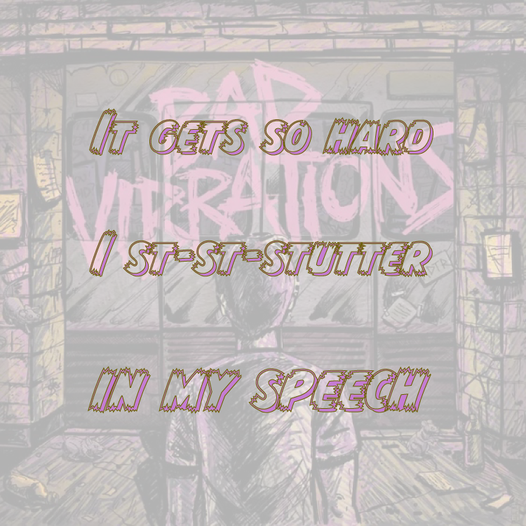
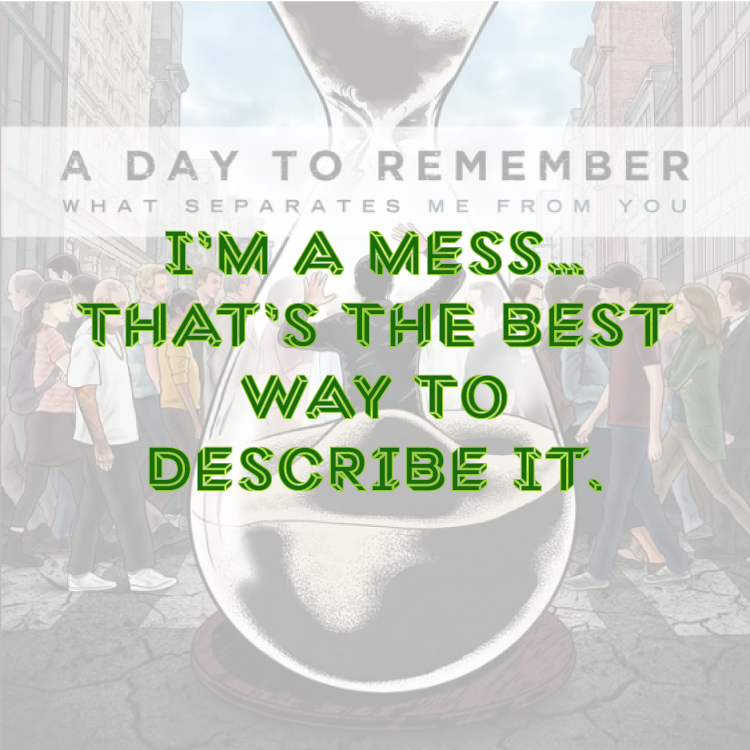
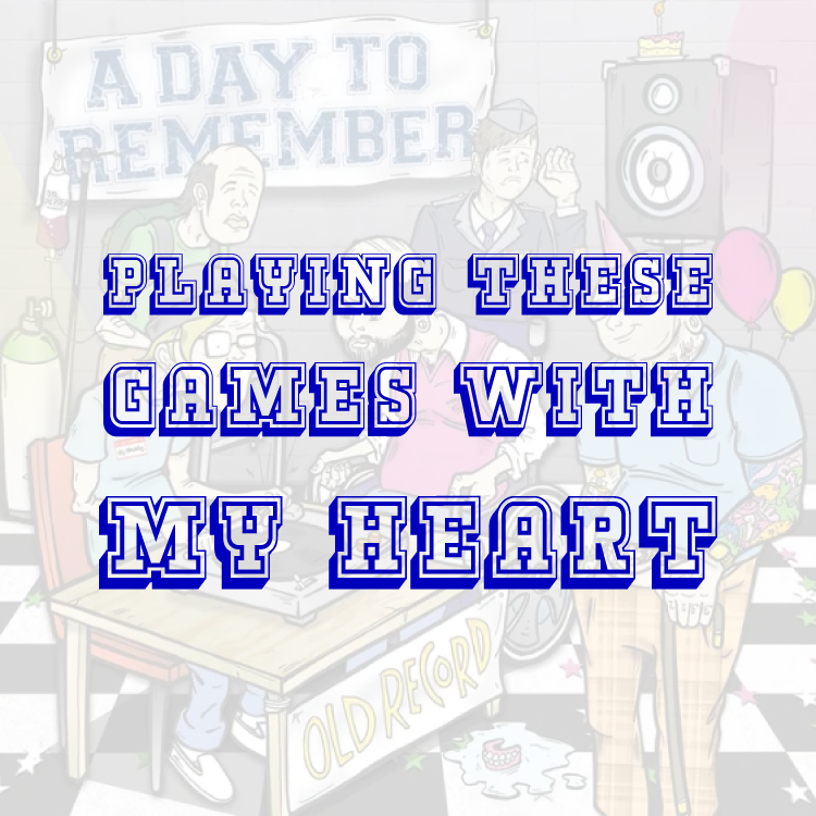
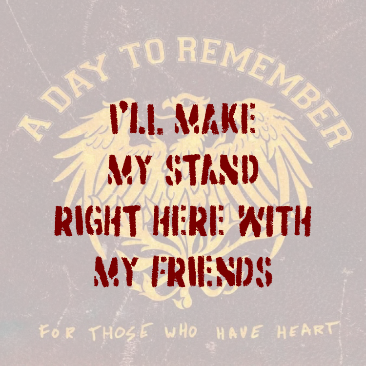
A Day to Remember Lyric Memes were done in Adobe Illustrator in 2025. Their album covers are at 30% opacity while short lines from a favorite song from each is in a relatable typeface centered in the front. Bad Vibrations is in CCMonsterMashOutline, You Be Tails, I’ll Be Sonic is in Macula, Heart Less is in Kegger Collegiate, and The Plot to Bomb the Panhandle is in Dirtstorm.
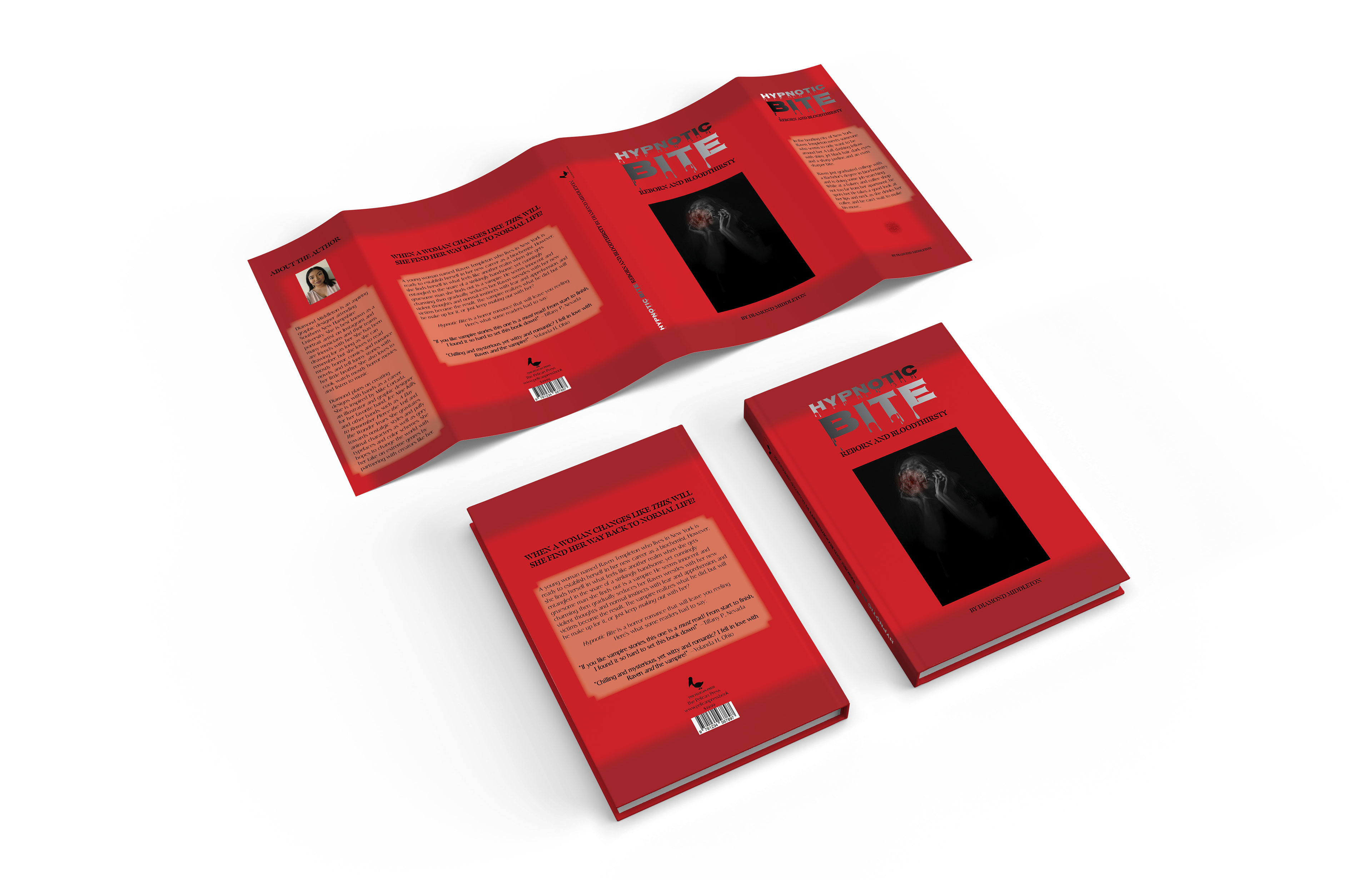
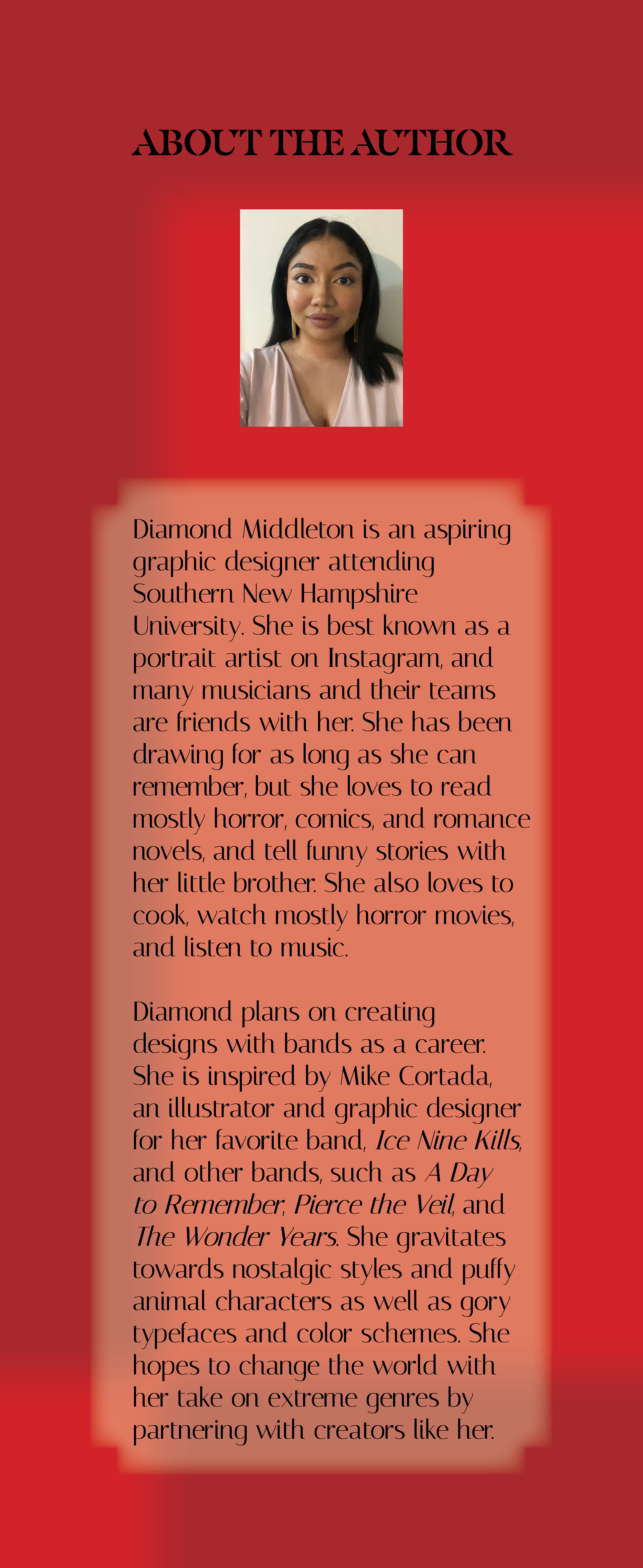
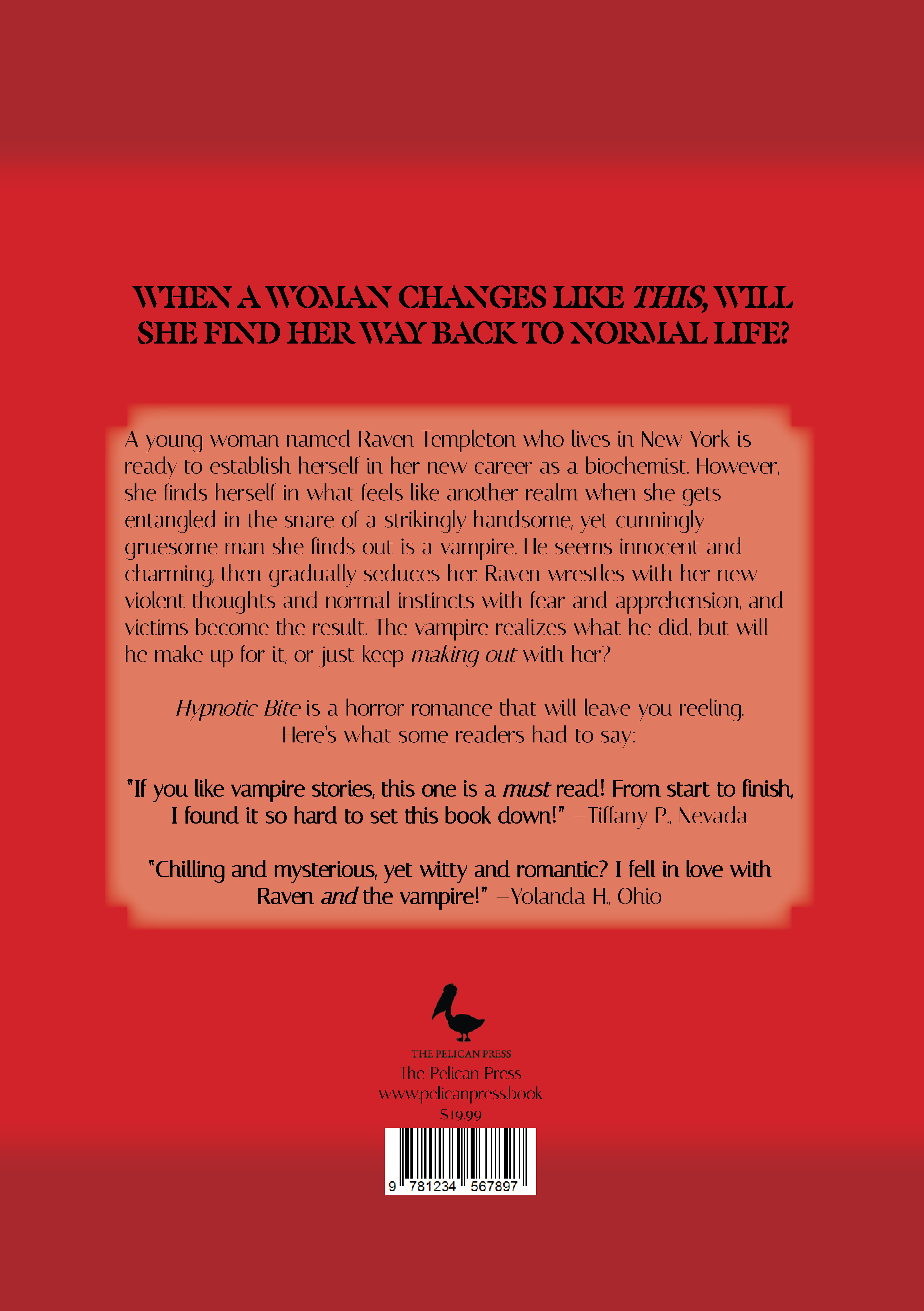
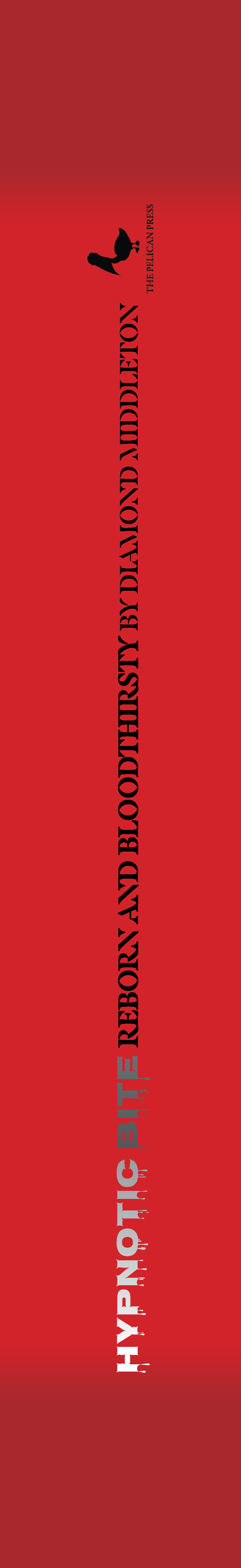
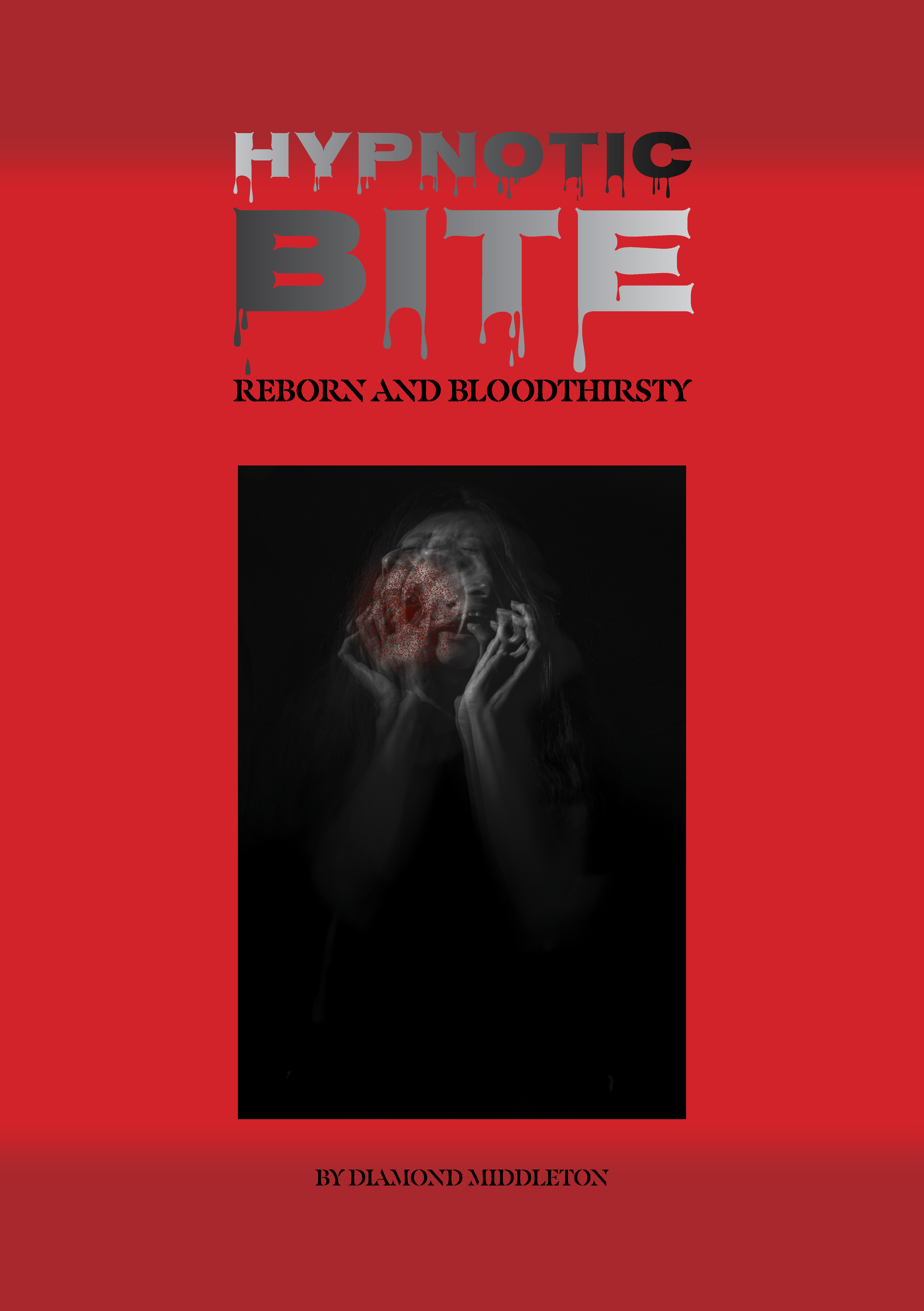
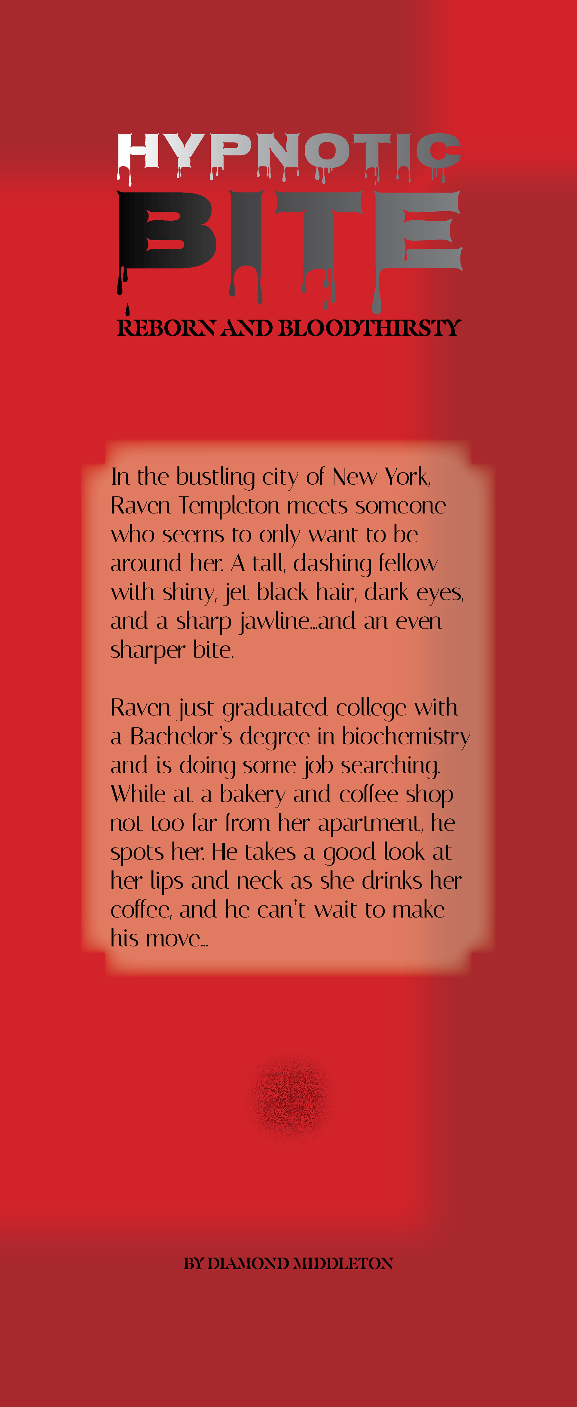
Hypnotic Bite: Reborn and Bloodthirsty is a book jacket cover design I made in 2024 and finished in 2025 using Adobe InDesign. It’s a horror fan-fiction about a young woman named Raven Templeton who is fresh out of college to become a biochemist and gets involved with a vampire. I found an image of a woman going insane on Unsplash by Camila Quintero Franco. I used the Nosifer typeface for the title, Masqualero Stencil typeface for the subtitle and other headings, and Italiana typeface for the body text and publisher information. I played with gradient and opacity settings from a dark red hue to create variation, then added the pages onto the book jacket mockup Adobe Photoshop template provided by Petr on Adobe Stock.
Illustrator
InDesign
Photoshop
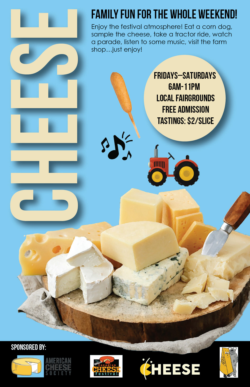
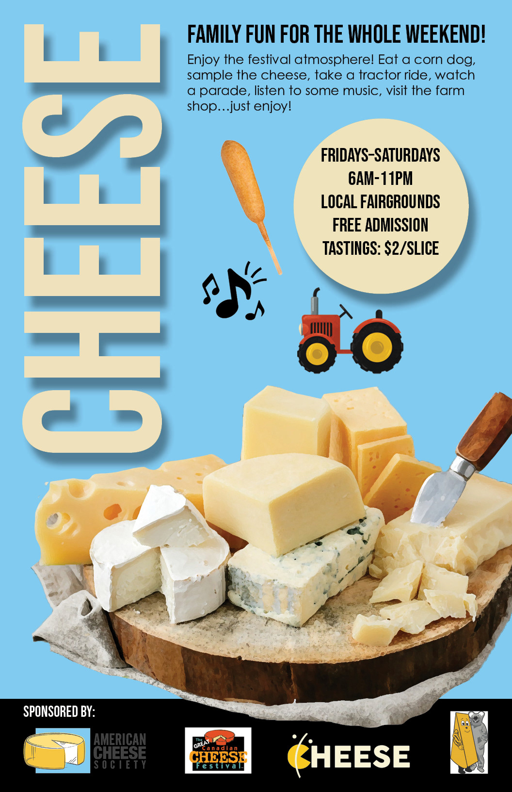
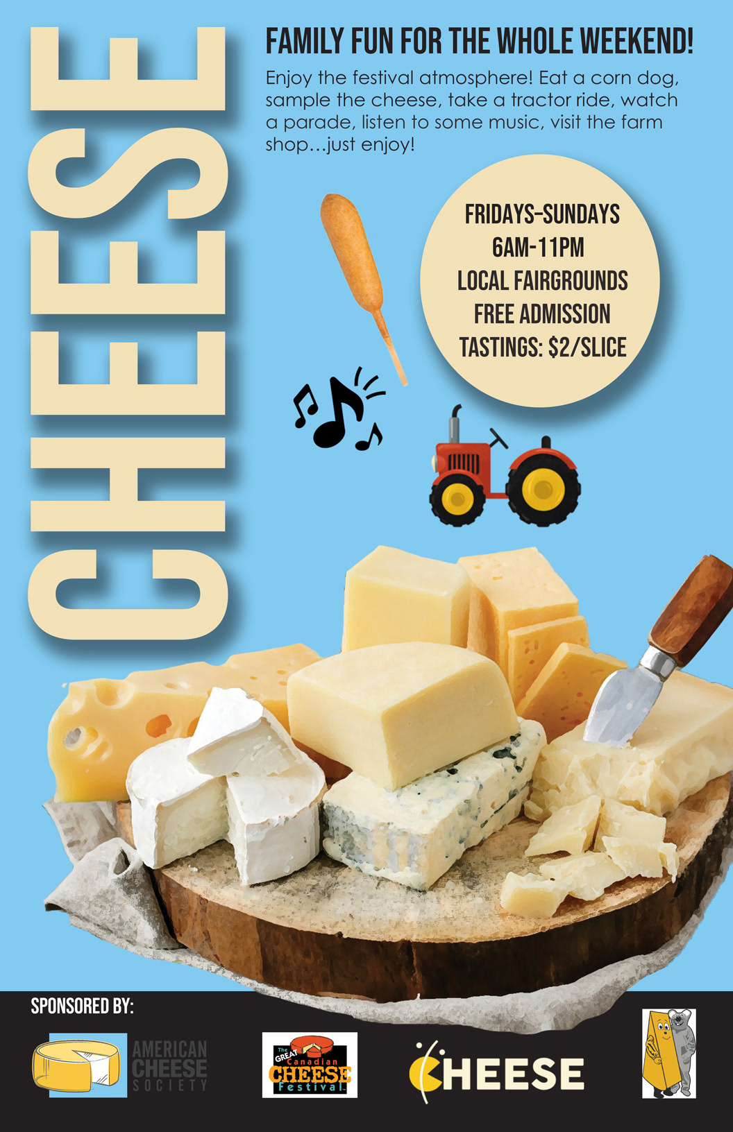
Cheese Posters from Adobe: spot the differences! I started these in 2024 and finished in 2025. They were made in Illustrator, InDesign, and Photoshop, respectively. I was provided with templates and was challenged to fix clipping masks while maintaining optically pleasing and reasonable placement between all three programs. The final color scheme was based on color picking the blue background of the first sponsored company’s logo and the light-colored center block of cheese on top in the middle. Bebas Neue is the typeface for CHEESE and FAMILY FUN. I proofread the body copy in Century Gothic Pro. I then added a few exclamation points, an ellipsis, and changed the date and time for the event information in the circle with the drop shadow effect. The templates originally came with a clipping mask of a photograph with various cheeses and cheese sponsor logos for Italian, Canadian, and American organizations. Now, negative space is filled more appropriately with design assets for the corn dog, music notes, and red tractor from Adobe Express.
Graffiti
Horror
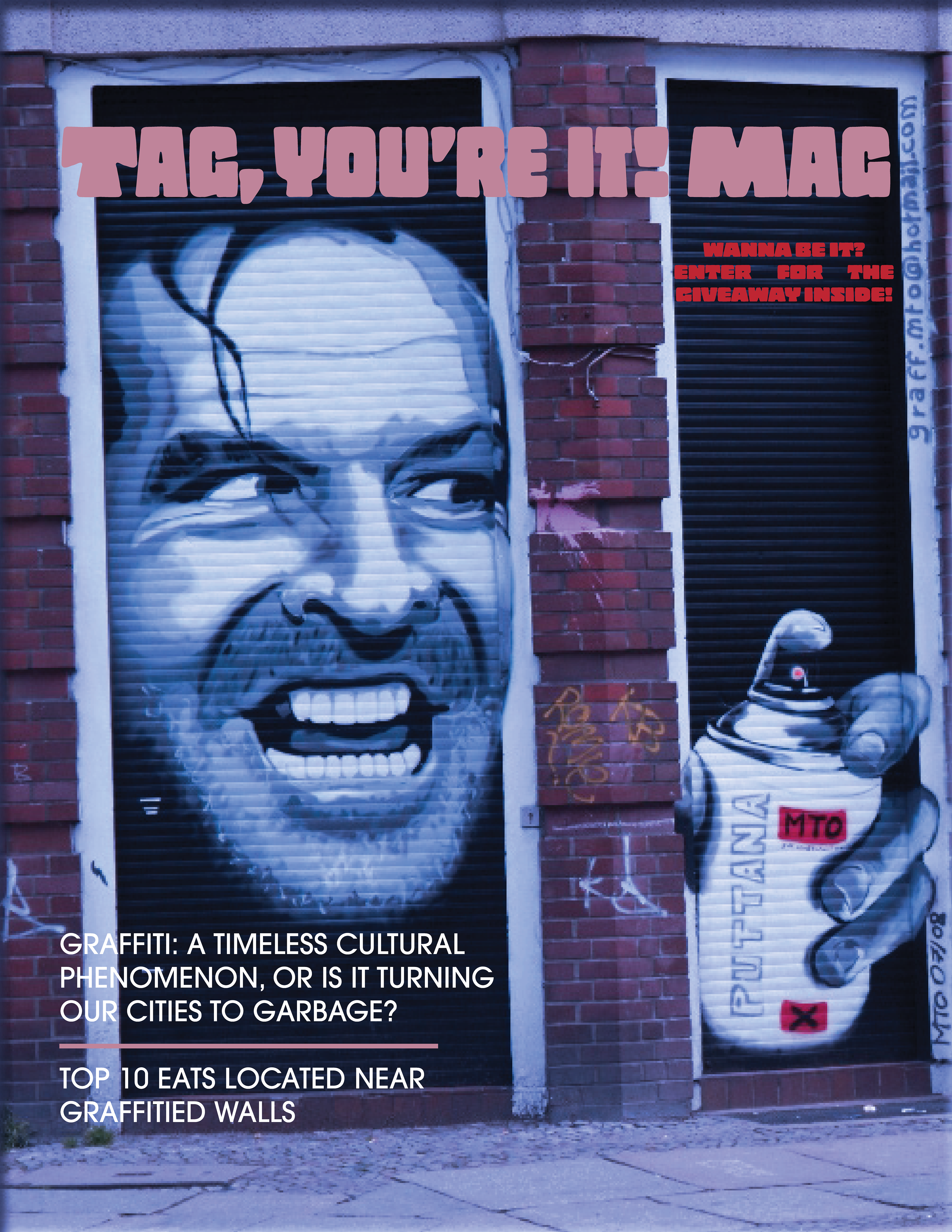
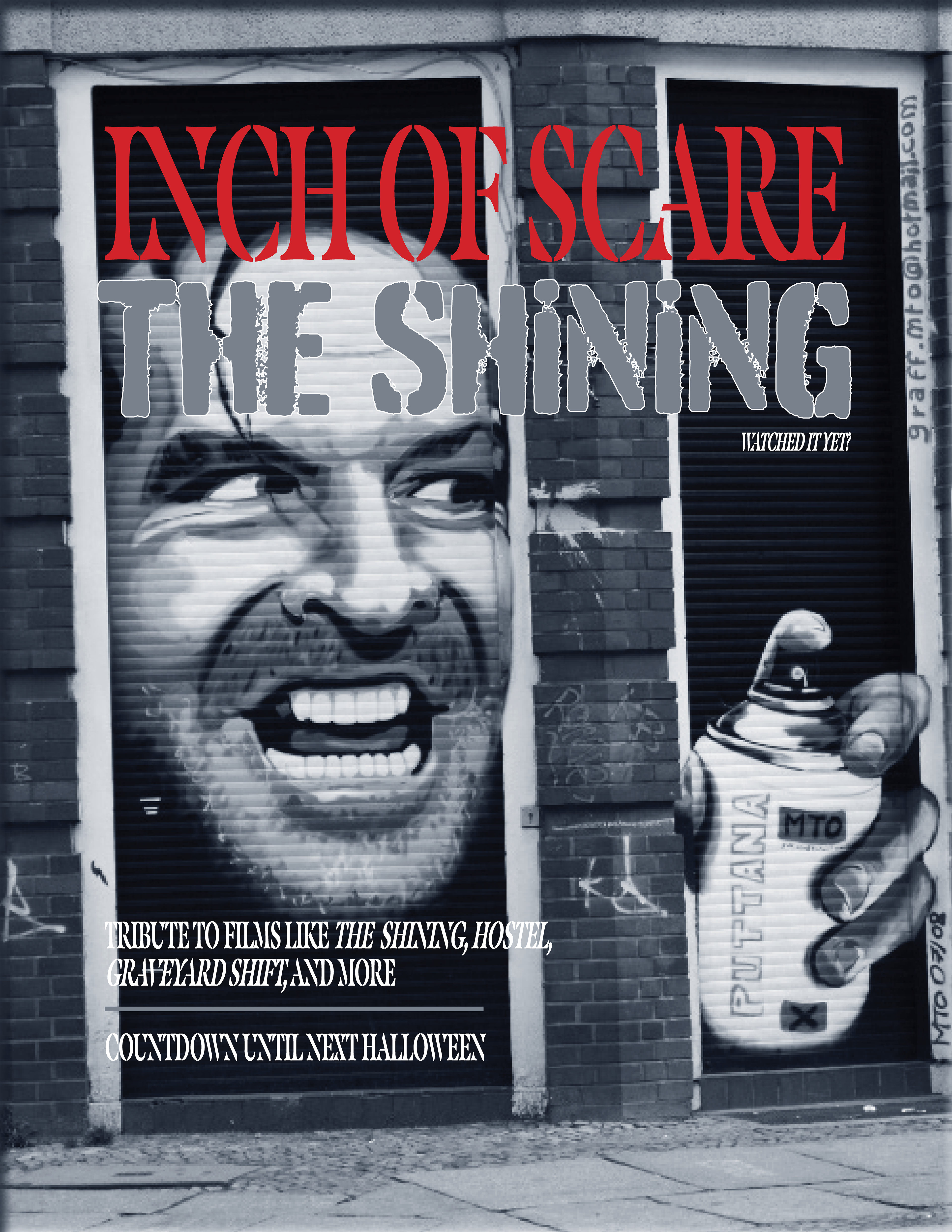
JACK NICHOLSON: Graffiti vs. Horror was a magazine cover swap done in 2023. I used a capture of graffiti—Jack Nicholson who played Jack Torrence from The Shining—based on the famous scene of him hacking through the door to edit in Adobe Photoshop for filters, then added typography in Adobe InDesign. The blue one focuses on graffiti itself in Copal Std and ITC Avant Garde Gothic Pro while the grayscale one focuses on the role Nicholson played being related to other horror in Masqualero Stencil and Burnaby.
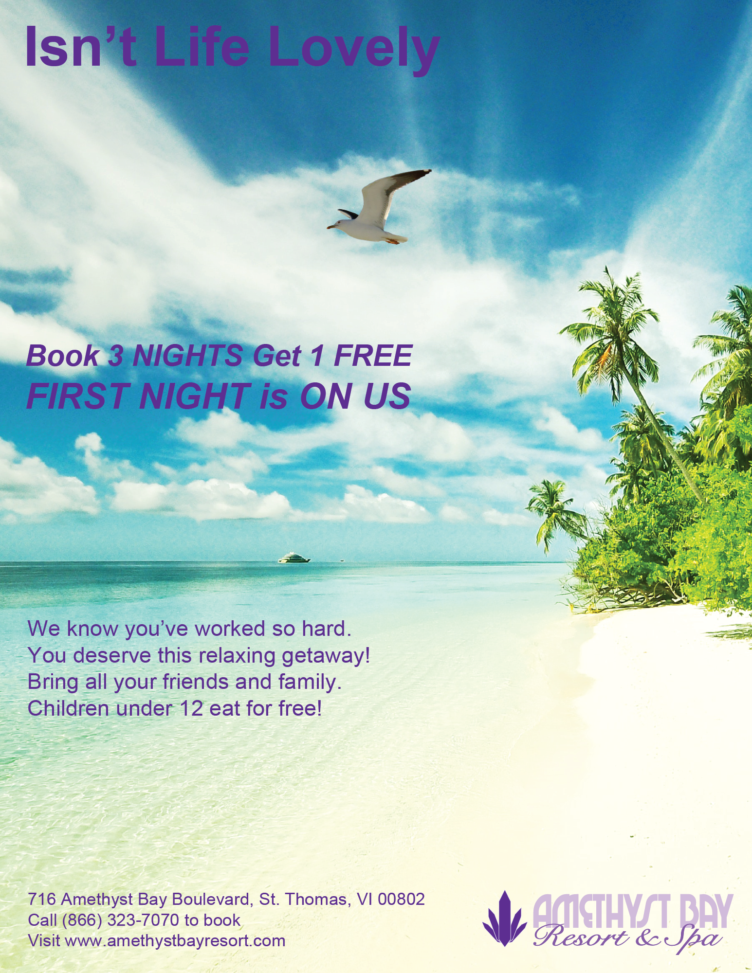
Amethyst Bay Resort & Spa is a magazine ad that started from a marketing campaign prompt for Amethyst Bay Resort & Spa in 2023 and finished in 2025 using Adobe Illustrator. I used Arial Bold for the headline, “Isn’t Life Lovely,” which does not have a question mark to be taken as less of an inquiry and more of a chill tone. The subheading in Arial Bold Italic is two lines with different font sizes for even tracking. The body copy and contact information are in Arial Regular. My beach image came from Pexels and the seagull came from Wikimedia Commons which I made with a transparent background in Adobe Photoshop.